The Woodshop on Fogo Island
Authentic. Elemental. Collaboration.
overview
The Woodshop on Fogo Island exists as a result of the collaboration between international artists, designers and local craftspeople. Together they created pieces of furniture, textiles and furnishings that evoke memories and traditions of the past.
In the summer of 2018, I was brought on by Carolina Soderholm of Design Holmen to assist the project through research, ideating, and iterating on visual materials for the woodshop. While the woodshop would remain associated with the Inn, the woodshop wanted to differentiate their brand identity that better represented their products.
Roles + Responsibilities
The Woodshop Team
Carolina Soderholm, Creative Director, Design Holmen
Alison Garnett, Creative Director, Field Trip & Co
Tyana Awada, Supporting Designer
process / what i did
Moodboards
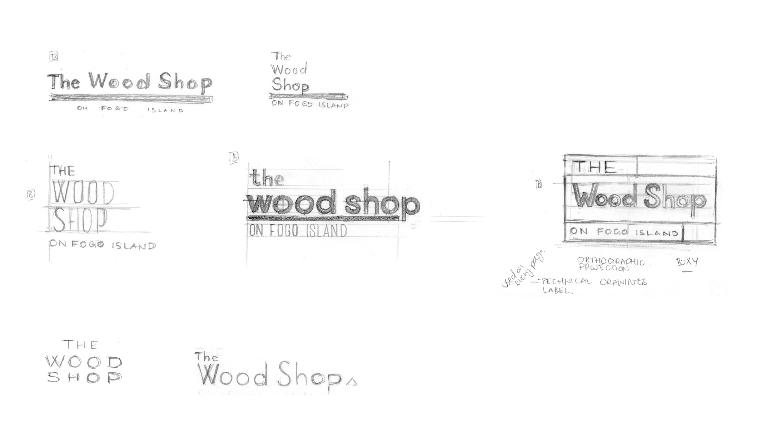
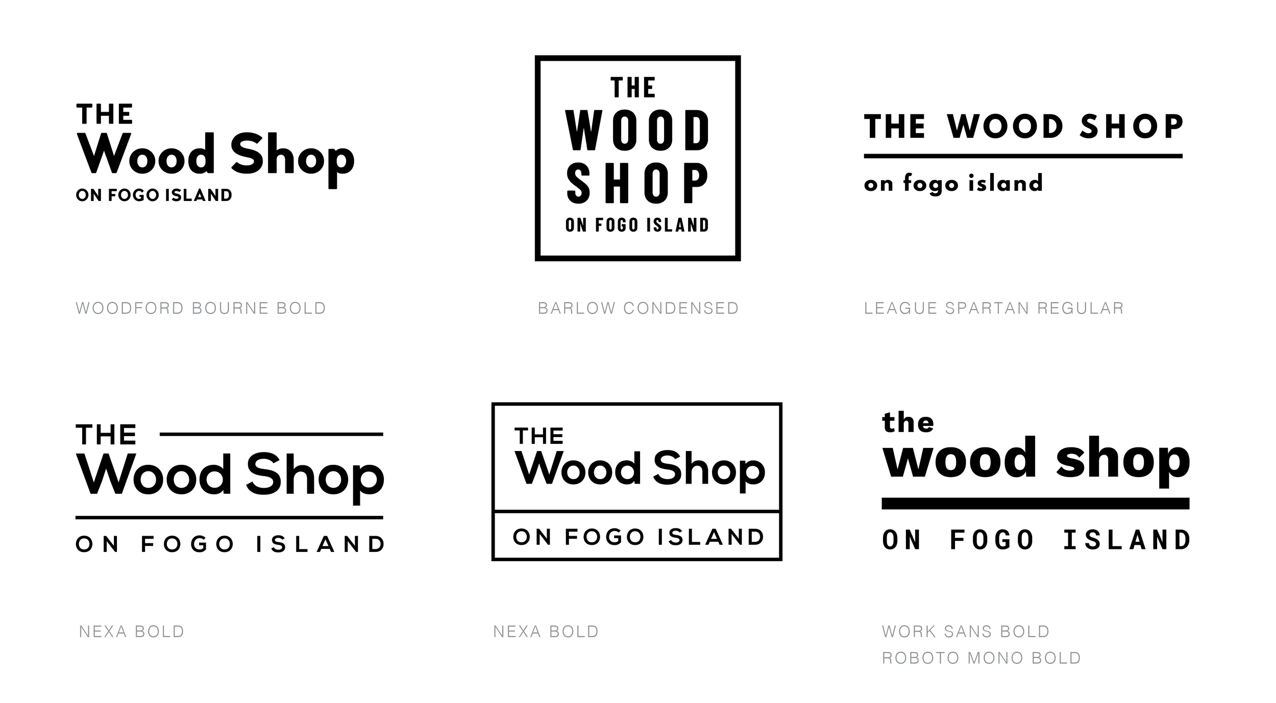
Logo + Monogram Exploration
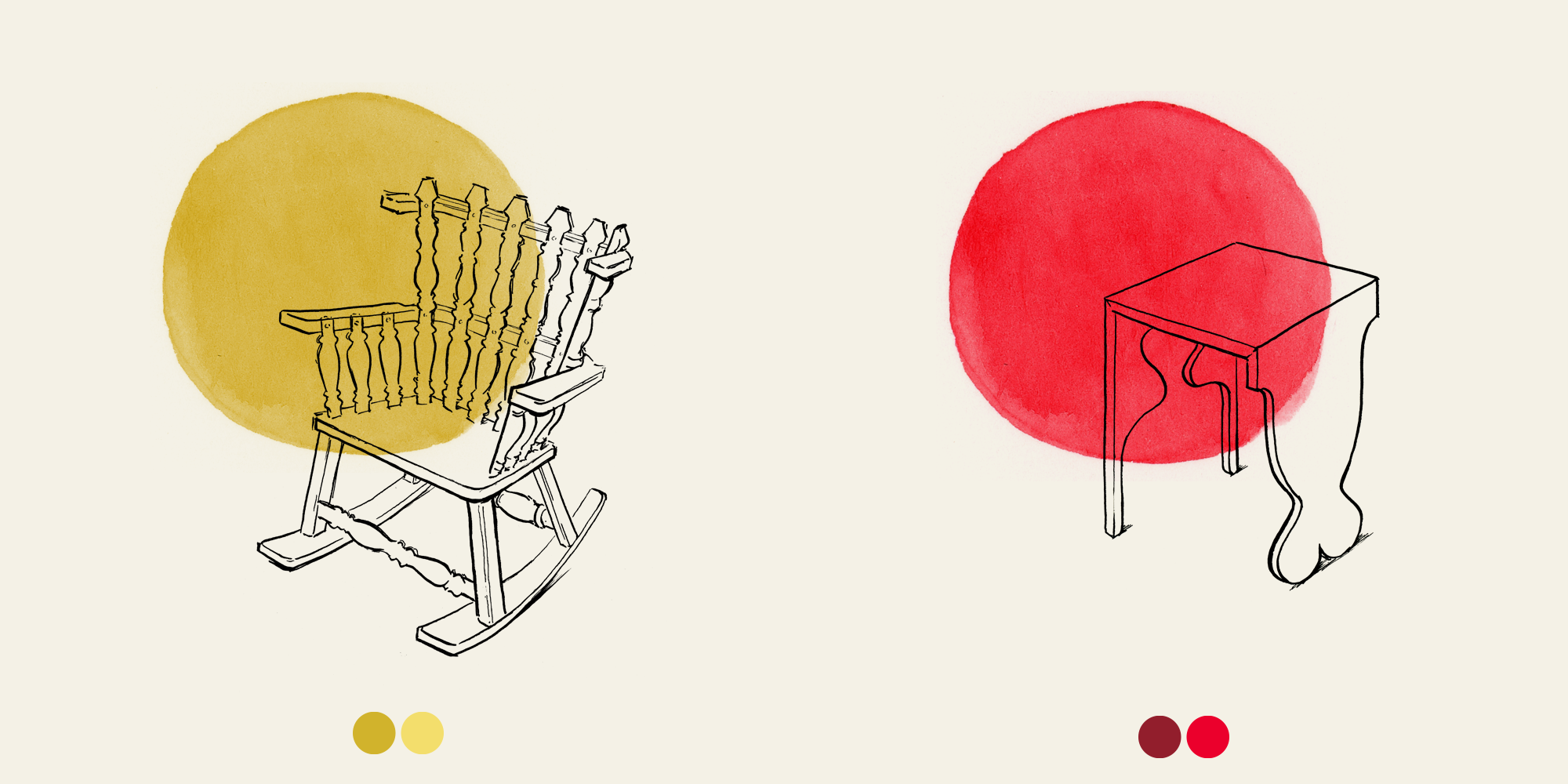
Illustrations
Icons
Patterns
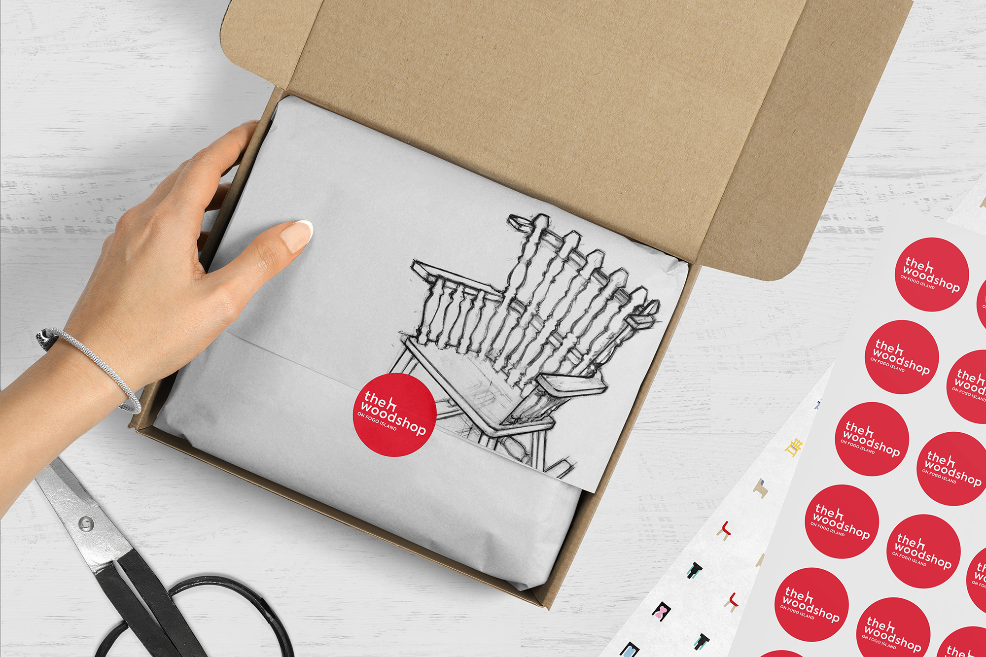
Packaging Research
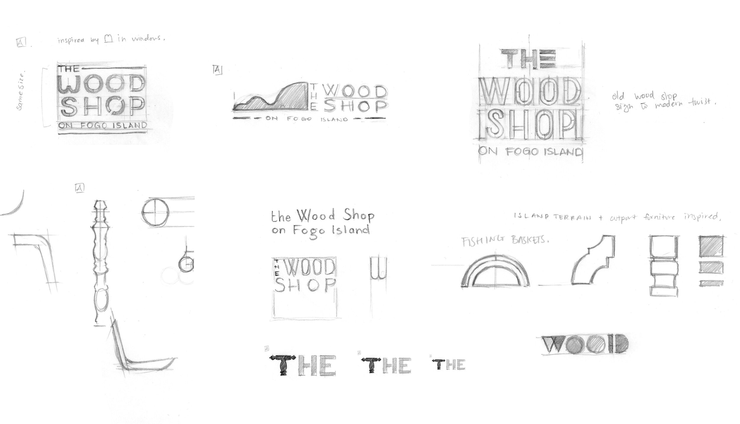
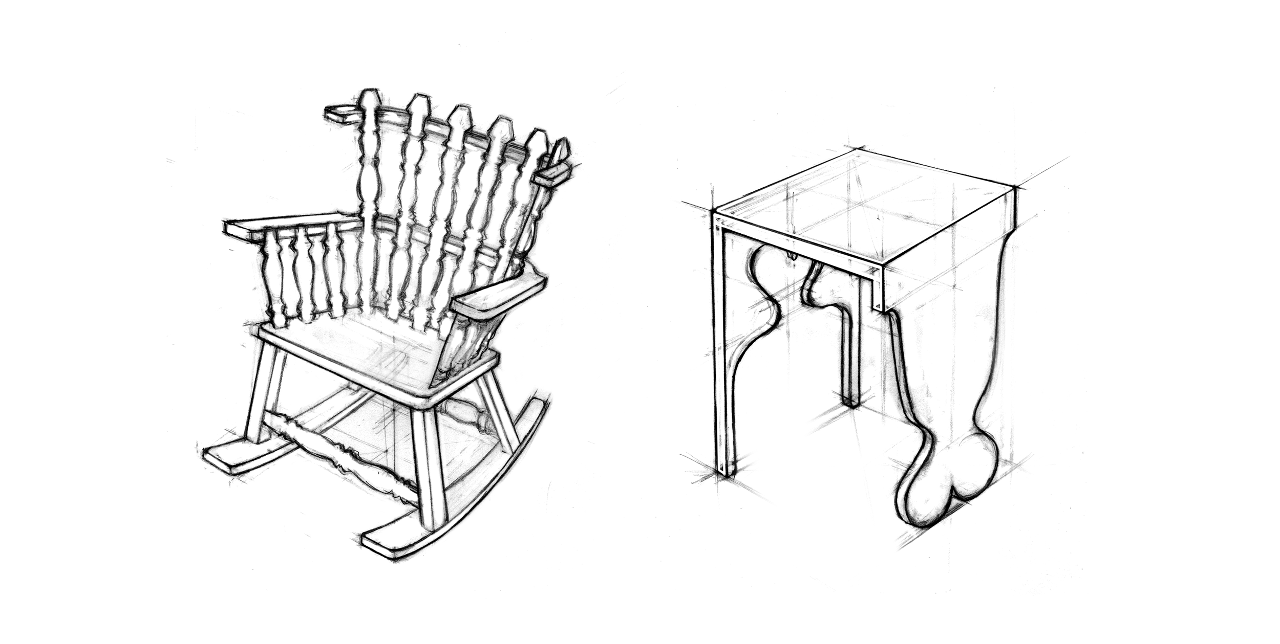
Sketches
Different motifs were explored to evoke imagery of specific pieces related to the wood shop.
Moodboards
The biggest takeaway from this moodboard is the shape of the window in the old wood shop in the top right quadrant. If we look at the shape of the panes and details, it appears to be like the letter “m”. We ended up taking inspiration and details from the window for the letterform of the “w” in “Woodshop”.

This moodboard was much more colourful in nature. We took inspiration from the history and traditions of the land but also from the Fogo Island Inn branding.

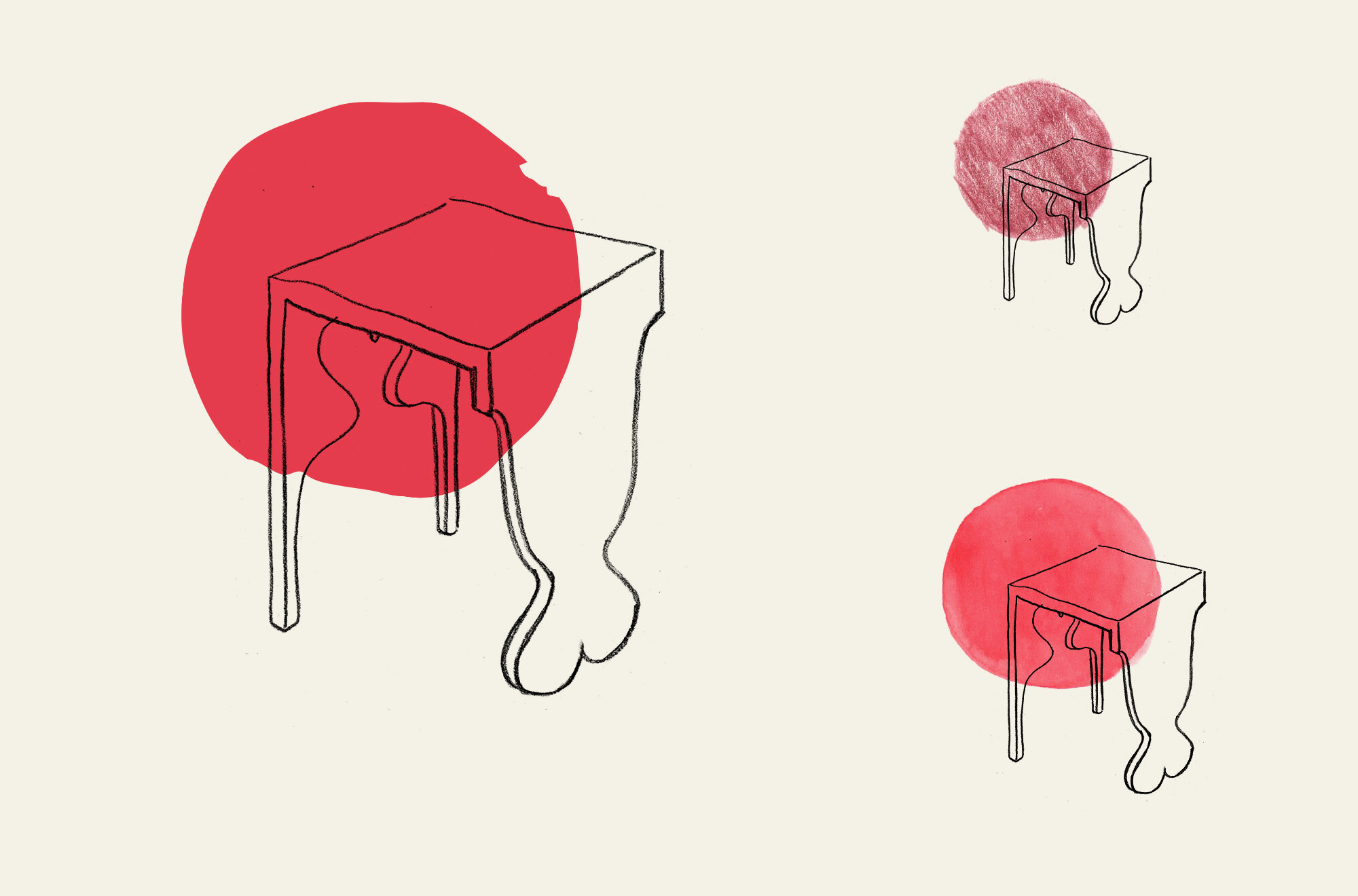
Mixed media + Illustrations
I explored dry and wet mediums to attempt at matching the iconic mahogany red of the boat houses.


These illustrations were created to determine whether or not they would work for labels and packaging. Ultimately, these illustrations were not used. But for our process it was necessary to explore these options as they offer that hand-crafted feel.
icon evolution
collateral
Here we implemented the icons and illustrations into composites. While graphically they worked fine, they did not necessarily work together cohesively. More importantly, were the visuals truly representative and reflective of everything that we’ve studied about Fogo Island’s heritage. For the final product, we went in a different direction and we found that we had to simplify what we had come up with. Sometimes focusing on the simple subtleties make for a more impactful approach.
Thank you to Carolina for bringing me onto the project, I learned so much from her experience! It allowed me to flex my creative side while producing a lot of work in a short amount of time. Being a part of the brand evolution was really rewarding.